ux

Tackling another design issue…

Probably the most popular module on my HR startup has to be the Recruitment module, which has taken over from the absence tracking module in the earlier days. We currently have over 500 job listings posted on HR Partner, with well over 35,000 candidates being tracked.

All in all, users love using the Recruitment area, however we have had some feedback that it is currently a little clunky to view individual applications. You have to constantly switch between the job listing view screen, which shows all applicants in the various stages of the hiring pipeline, and the main application view screen, and back. This consumes valuable clicks and precious seconds of time - especially when you have hundreds of applicants for a job.

We needed a way to allow our users to quickly step between job applications without the constant screen switching. We also didn’t want to clutter up the screen real estate too much. This was a tough problem to solve. But we had some good UX people on the team, and I wanted all of us to brainstorm and learn how we could achieve this end goal.

Now, currently on the employee view screen in HR Partner, we have this little pop up widget that allows you to skip forwards or backwards to the next 1 or 2 employees quickly without having to go back to the employee list.

Employee Switch Widget.png

Our immediate decision was to perhaps build something very similar in the Applicants view screen as well - to allow the user to jump ahead or back one or two applicants at a time. But then we though that it could be impractical, as applicants weren’t really sorted in any order, and there could be too many times when the user needed to jump from the top to the bottom of the list.

So back to the drawing board we went. We needed something that could be obvious and ‘there’ when needed, and out of sight when not needed.

Solution: We decided to build a sidebar popout widget that the user could call up when needed.

Applicant Sidebar Icon.png

That’s it. The end result was one tiny little icon that is SO easy to miss (which is why he have that popup appearing when our users first go to this screen). An infinitesimal change, but one that can have a big impact when clicked.

You see, clicking the icon slides out a narrow (around 200 pixel wide) sidebar window which shows all applicants who are in the current stage of the job pipeline as well.

Application View Sidebar 1.png

Clicking on any candidate name will open up the same Application details window, where you can see their answers to the application form, read their resumes, check their interviews and email history and fill in the scorecards and leave comments. AND - it leaves the sidebar open while doing so, so you quickly jump from candidate to candidate without interruption.

Application+View+Sidebar+2.jpg

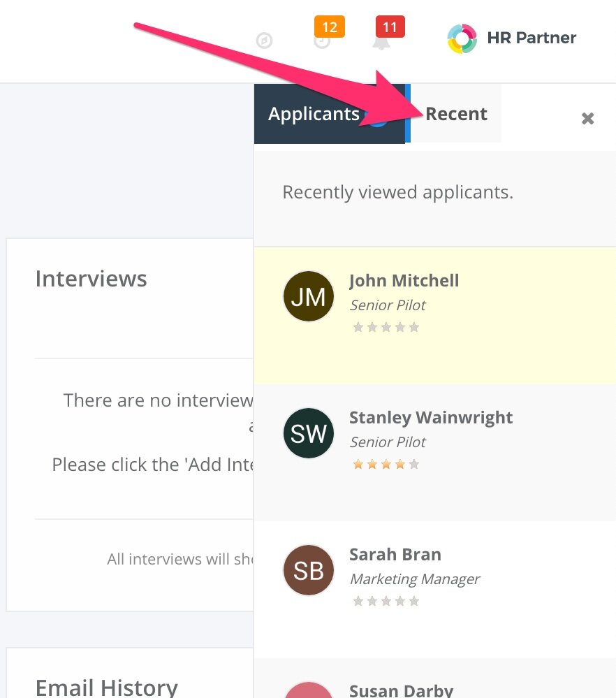
While working on this widget, and based on our customer feedback and even our own experience with using our Recruitment module to hire internal team members, I remember that I was often circulating across 4 or 5 applicants, especially towards the tail end of the recruiting process, when we were trying to narrow down our selection to more suitable people we wanted to shortlist. I recall that as being quite tedious when I had to jump back to the list of 100 odd candidates and try and remember who our top picks were.

So we decided to include a ‘Recent’ tab to the sidebar, which shows you the last 10 candidates that were looked at. Now we can use this tab to quickly cycle between those last few candidates when discussing with the team.

Here is the new sidebar widget working how we expect it to. Doesn’t this look easier than the earlier video with all that back and forth??

Lastly, another common complaint about the Application view screen was the fact that in 90% of instances, the user would want to change the ‘Stage’ that the candidate was at while reading that screen. For example, they might want to move the candidate from the ‘Applied’ stage to the ‘Interview’ stage based on their suitability.

They could certainly do that now, however, it required changing the pull down menu, then scrolling down to the bottom of the application form and clicking ‘Save’. People were often forgetting to click ‘Save’ when they got distracted by the myriad of other information on that screen.

So we decided to introduce an unobtrusive ‘auto save’ whenever that drop down was changed. It ran instantly, in the background, and just popped up a discreet little ‘Saved!’ notification for a few seconds before disappearing again.

Application Stage Auto Save 1.png

Once again, we haven’t changed anything on screen, as our users were completely used to navigating around. We simple introduced quiet background behaviour to do the heavy lifting for them.

I guess that is one of the learning points for me, especially. Good design doesn’t mean throwing out the baby with the bathwater or making drastic changes. It is about minimising the ‘surprise factor’ for the user, but still letting them choose how they want to work and get out of their way when we have to.

It is early days yet, but I think we have gotten close with the excellent work the team have done on this.

When your SaaS UX design doesn't scale

scaling.png

I can clearly remember the first ever sign up to my HR SaaS project - it was a small company in the UK with about 10 employees. What a thrill that was. Over the next couple of years, we signed up more companies of even greater size, until we got a pretty good base of customer companies that were around the 100 employee mark each, on average.

Until this month, when we landed a deal for a major UK manufacturer with over 1000 employees! That was a 10x jump on our average customer size. Yikes!

Now, initially, I wasn’t at all worried. I am a tech guy by nature, and had designed my SaaS from the ground up to be scalable. We have multiple load balanced servers, replicated data stores, separate queueing services for background tasks etc. This wouldn’t even have caused a small sweat on our hardware infrastructure.

However, a designer I am not, and I quickly realised that our actual user interface would struggle under such a vast amount of user data.

Let me give you an example. On the main dashboard of our HR app, when the user first signs in, there is a little widget which show all the upcoming birthdays for your staff. It actually shows you all birthdays for the past 7 days, and the next 14 days coming up. This helps the HR manager to plan for office parties etc. or to send greetings out to the team.

HRP Birthday List.png

Now, in a company of about 100 employees, this list really never grows to more than about 7 or 8 people on the list at any one time. This makes the widget a nice sized box on the page that stays ‘above the fold’ on a single page. Everything else on the dashboard fits around that quite well.

However, after we finished assisting the new company to upload all 1000+ employees into our system, I was horrified to notice that the birthday list was about 60 employees deep. In fact, the law of averages say that in the 3 week time span that the widget shows birthdays for, there will be an average of about 58 employees on it at any one time, in a 1000 employee company.

This made the widget overly tall, and pushed everything down the page. Users would have to scroll down quite a way on the page to see other critical dashboard data. Oops.

I learned the hard way that test data and expectations of low to medium data volumes had dictated some pretty serious limitations as to how I designed the widgets and most of the interface in general.

Thankfully, we have some great designers on my team now, and we put our heads together to work out how to best resolve this issue. We could

  • Dynamically reduce the number of weeks spread for the birthday list depending on the volume of employees in a particular company

  • Let the customer specify the date spread to show the birthdays for, or

  • Set a hard limit on the number of birthday that we would show on the widget and show only those close to today’s date

All of these were discussed and dismissed as being a bit too limiting. After all, our other users loved this widget and frequently told us how it helped them to relate to their staff better.

In the end, we went with - incorporating a mini scroll bar within the widget. Anything up to 10 birthdays on the list and it would show like it always did (so therefore no difference to nearly all our other customers). More than 10 on the list and the widget would peg itself to 500px in height (which still fits on most screens), and a little scroll bar would appear on the right of the widget allowing the user to scroll down the list of birthdays.

My rule #1 for interface design is “Don’t change anything that customers would be already used to unless it is absolutely necessary”, and I think this design choice fits that well.

So far so good with this new customer, as they seem to be loving the system. We will be working closely with them over the next few weeks to ensure that all other elements of our interface are capable of handling 10x the data presentation that we are used to.

How are things with your SaaS? Have you come across similar situations? Or were you smart enough to design ‘defensively’ and cater for these sorts of edge cases?


Getting stuck into design

While I consider myself a ‘full stack’ developer, taking care of everything from the back end to the front end of town, one area that I tend to lack is in my design skills. I am trying to learn more about good graphic and user experience (UX) design principles, so that I can improve the software I write without having to resort to a third party expert every time.

What better way to start than with my flagship SaaS HR product, which is in use by over a thousand people all over the world? Looking at the stats on Google Analytics, I see that the most common screen used on my app is the employee Leave Request screen, which employees of our customers use to ask for time off from their managers.

While we haven’t really heard any real complaints about this screen, I knew we could make it easier for people to use, without too much effort. Here is the original screen:

Employee_Leave_Request_OLD.png

I thought the blue bordering on this screen made it look a little dated. Plus the title at the top which says “Request Leave or Time Off” seems a little disconnected from the rest of the screen. Lastly, the one bit of feedback we’ve heard from employees was that they would like to see the company leave calendar on here which was useful to them when planning time off.

So, I sat down for a morning, and reworked the screen to remove the borders, and make it look more like a plain paper leave application form:

I removed the top title as it was redundant, and removed the borders around the window. I also squashed the main form down a little to increase white space around it and make it look more like a paper form that the employees would have been used to filling out before.

I also removed a lot of extra words within the form (i.e. the help text below each field) and made them popups that would appear when the user clicked on the ‘?’ icon above each field. Just to make things cleaner and have less word clutter.

At the bottom of the screen, you can see where I have ‘squished’ the old list of leave balances down, which is still readable, and added the company leave calendar to the system.

After some initial testing, I made some finer touches for the final version:

Employee Portal Leave.png

Not much that is immediately obvious, but they did make the form seem aesthetically better. I fixed the alignment of text across the form, plus I added a background colour to the form fields themselves so they stood out a little and didn’t make the form look so washed out and overly white.

What do you think? We actually saw an uptick of activity on this form already this week since we put out the update to production, and so far no one has emailed in to complain about anything, which is a good sign IMO.

Because I am all about constant learning and improving, I would love to hear from some experienced designers out there as to how I could make things better.


When your hard work becomes invisible

In my latest project, I have been working very hard on getting the UX right.  I want the interface of my web app to NOT fight the user every step of the way, and to make some semi-intelligent guesses as to what they want to do.  Wherever part of the interface looks clickable, I want the user to be able to click on it and get the result they expected.

That sort of precognition takes hard work - LOTS of hard work.  Just today I spent pretty much ALL day on one small piece of functionality, that at the end of the day, my users will probably never really notice.

Come to think of it, *I* pretty much don't notice it now that it is finished, but I know it is there, and it is making my movements through my web app a lot smoother and logical.  

Just this evening I was thinking about it, and I was a little sad that all my work was essentially invisible to the end user - after all, they only usually notice things when they DON'T work.

But I was reassured by something a wise man once told me - "Character is what you do when no one is watching".  I like to think that my app has good character.